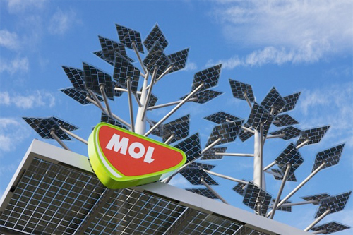
Hungary's leading energy provider MOL has allowed a local Budapest firm to branch away from conventional forecourt design and adopt a radically green initiative.
The approach taken by Zsolt Zombori and his team at Európa Stúdió was to produce a flagship design to demonstrate Mol's commitment to eco-sustainable solutions and visually present the MOL brand as a leading innovator in fuel retail and green energy.
The result is a solar tree and canopy design solution with a functional if slightly dubious aesthetic quality. From a functional perspective, I see the design working as both a marketing tool to reposition MOL's brand identity and as a visual marker to attract passing motorists from Budapest.
Unlike some eco-designs, for example telephone masts disguised as trees, which blend into the natural environment seamlessly, there is a clear distinction with this design to maximise the visual impact of the elevated signage which carries the MOL logotype. You can see how Zsolt Zombori has incorporated multidimensionality into the design, having fun with architectural plains of view produced by the canopy's angled projection and the adjacent MID (Major Identification Sign) which looks like a green Rosneft version. Of course from a ground-level and driver perspective, the positioning of the signage takes on added significance.
For the solar panelling to be as efficient as possible, the column structures have to stand at some height to be functional, adding to the overall cost. The hefty price tag on the project,claimed to be over $300 million is twice that of a regular filling station, and raises a considerable question mark over the return on design investment (RODI).
The pump's design has rather over-the-top detailing which might put more people off than than on. The 'air to water' heat pump system means that the forecourt building is self-sustainable, but only on a sunny summer's day. The facade and the roof is an evergreen colour with the hope of merging with the "mountain" environment but this is counteracted by the green totem.
The forecourt shop,Fountain Green, is built using recycled construction materials. Inside, Fountain Green provides a customers with a range of organic and bio-friendly products.
It would appear that the Mol is delivering on its green promises but consumers are savvy enough to appreciate truly green design and policy over green veneer.
The result is a solar tree and canopy design solution with a functional if slightly dubious aesthetic quality. From a functional perspective, I see the design working as both a marketing tool to reposition MOL's brand identity and as a visual marker to attract passing motorists from Budapest.
Unlike some eco-designs, for example telephone masts disguised as trees, which blend into the natural environment seamlessly, there is a clear distinction with this design to maximise the visual impact of the elevated signage which carries the MOL logotype. You can see how Zsolt Zombori has incorporated multidimensionality into the design, having fun with architectural plains of view produced by the canopy's angled projection and the adjacent MID (Major Identification Sign) which looks like a green Rosneft version. Of course from a ground-level and driver perspective, the positioning of the signage takes on added significance.
For the solar panelling to be as efficient as possible, the column structures have to stand at some height to be functional, adding to the overall cost. The hefty price tag on the project,claimed to be over $300 million is twice that of a regular filling station, and raises a considerable question mark over the return on design investment (RODI).
Strategically questionable greenwashing? |
Mottled evergreen facade and side canopy shot |
It would appear that the Mol is delivering on its green promises but consumers are savvy enough to appreciate truly green design and policy over green veneer.
No comments:
Post a Comment