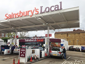
Sainsbury’s latest ‘Local’ petrol station and convenience store in Putney SW London is notable for us in the petrol retail business for its skeletal single skin canopy devoid of the normal lower second false skin comprising flat ceiling strips that are to be found on older Sainsbury’s canopies and virtually all other petrol station canopies throughout the world. The other notable omission is the brightly decorated canopy fascia in favour of large canister letters.
The question is, are Sainsbury’s bravely rethinking the
concept of the petrol station canopy or recklessly under-branding their outlet?
Judging by the steady flow of customers on the sunny spring Saturday morning we visited the
answer is more likely the former. So what are the benefits of Sainsbury’s
minimal approach? With around 250m2 less under-decking at say $30/m2 and 80m
less fascia at say $150/m then there may be an overall saving of around $20,000
which may be around half the overall cost of the complete canopy. On the cost plus side, canister
letters would cost at least $2,000 and there would be an additional
cost to finish the canopy steelwork in a more durable and presentable white
paint as opposed to the normal galvanised finish. Other drawbacks of the
Sainsbury’s design include having to mount the LED task lights on to the main
beam above the pumps rather than normal location between the pumps which
affords the best vertical illuminance of the pump and spreader.
Removing interior false ceilings has been the trend in many
forms of retail for decades now as it provides the opportunity for a higher ceiling and more of
a warehouse look suitable for certain fashion outlets and discounters. That Sainsbury’s
has extended the same logic to exterior canopies should not therefore surprise
us. We say the Sainsbury’s brand is strong enough for consumers to feel equally
comfortable under a minimal canopy as a conventional canopy. For less well
known brands including independent petrol station outlets we guess the
minimal approach may suggest a lesser quality fuel unless the design is
executed with skill and does not look like a crude agricultural building. By definition
minimalism has less components but those components must be perfectly detailed
which alas is slightly lacking with Sainsbury’s design which has unsightly
bracing members confusing the lines of the structure. Overall we say Sainsbury’s
have earned their $20,000 saving by cleverly thinking out the box. Whether it’s
a trend others may follow remains to be seen.

No comments:
Post a Comment